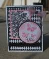
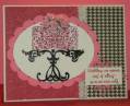
This is for color challenge 398 - Very Vanilla, Pretty in Pink and Primrose Petals. My card subs in the SU ink that seemed closest to Primrose Pink (I don't have PP ink yet), which to my eye was Melon Mambo and - I cannot tell a lie - Gina K. Innocent Pink paper for Pretty in Pink (also a very close match but I like it better).
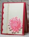
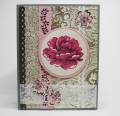
Creams and pinks are so lovely together that I did two cards for this challenge. This is the first. I think it has a Victorian look, which was fun to play around with and so natural for these colors. I used browns and gray for my neutrals. There are two Soft Suede backgrounds, a Chocolate Chip lace edge (dessert!), CC vines on pink and 2 VV rickracks, plus embossed vellum and three small Pretty in Pink blossoms, all to play up the focal floral image. Think I got enough stuff stuck on this card? Ha! I kept waiting for it to jump off the table and run and hide from me in the laundry room!
Thanks for looking!
Date: Thursday, October 25, 2012 GMT Views: 2347
Favorited:5
Registered: May 9, 2007 Location: Wisconsin Posts: 8703
Sun, Oct 28, 2012 @ 7:02 PM
This is so pretty!!!
------------------------------ Mary ~~ QFTD #152, FS#514CC Guest Design Team 2012, 2013, 2017 & 2022 2014 CAS Spring Design Team MemberSC Guest Design Team 2015 & 2022 SU Consultant "Life's greatest adventure is finding your place in the Circle of Life" - Lion King