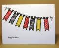
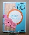
This is for Friday's HYCCT challenge to create a card for a birthday. I always think that Primrose is going to be lighter when I ink it up, but it always looks so red. Oh well...once I committed, I looked at the color coach and say that summer starfruit and basic grey went with it. Primrose was supposed to be my "pink"!
Date: Sunday, October 21, 2012 GMT Views: 372
Favorited:4
Registered: April 23, 2006 Location: Looking For Teapots! Posts: 59742
Mon, Oct 22, 2012 @ 7:19 AM
Hey there! I see pink! Snort! No worries...this is a wonderful little card...and I can tell that the banner photo inspired you.....Gotta love a clean and simply card...a reminder that sometimes less is more! You did good!
I love that the future recipient of this card is gonna get a smile from their mailbox!