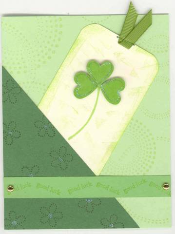
A friend asked me to make several St. Patrick's Day cards. This was a real challenge because I do not have any St. Patrick's Day stamps. I had to borrow the word stamps.
Date: Monday, February 13, 2006 GMT Views: 1452
Favorited:7
Registered: June 14, 2005 Location: Finland Posts: 463
Sun, Feb 19, 2006 @ 4:42 PM
I actually like this as it is. i think this is one of those cards that gets "flattend" when scanned, in real life I�m sure it looks much more "3-D" whith the BG-stamp and the sweet clower!
Registered: August 4, 2004 Location: St. Louis, MO Posts: 9969
Sun, Feb 19, 2006 @ 6:47 PM
I think it is really cute! The only thing I would add, since you asked, is a mat of the dark green around the tag part...I think that would make it really pop.
Registered: May 2, 2004 Location: Far, far away Posts: 24216
Mon, Feb 20, 2006 @ 12:39 AM
I love it! I agree about the dark green mat, though... or even just a little dark green ink around the edges of the tag. But really, it's fab - perhaps St Patrick's Day just doesn't have mass appeal?
Registered: February 4, 2005 Location: N. Calif. Posts: 765
Mon, Feb 20, 2006 @ 9:12 AM
I really like the way this is layered and how you added the saying w/ brads! I agree w/ the above about maybe a dark border on the tag, but it really is nice the way you made it!
------------------------------ "A mistake is simply another way of doing things." Katharine Graham
Registered: July 13, 2004 Location: Grasonville, MD Posts: 7632
Mon, Feb 20, 2006 @ 9:18 AM
I agree with all of you the tag sort of gets lost - in real life it does look better, but maybe using green galore behind the tag would have tied it all together - I think using garden green might have blended too much with the triangle piece. Black might have been a nice addittion. Thanks for all your help!