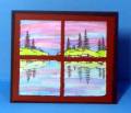
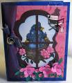
I cut through the embossed panel and its mat to create a window through to the card base for this HYCCT challenge. I felt this color scheme would be good for either a male or female recipient of any age. I swiped my ink pad over the embossed designer paper to help highlight the embossed images.
Comments are welcome! Thanks for taking a closer look at my card.
Date: Sunday, November 6, 2011 GMT Views: 1074
Favorited:13
Splitcoast Dirty Dozen Alumni Creative Crew SU Design Team Alumni Demo Challenge Leader Splitcoast Challenge Host
Registered: February 8, 2004 Location: South of Oklahoma, North of DFW Airport = North Texas! Posts: 44409
Mon, Nov 07, 2011 @ 7:47 PM
I really like that additional depth you've brought out by adding the ink to the embossing! You're so right ... a great card for this wonderful cause. Thanks for playing along in my "Looking In On You" challenge!