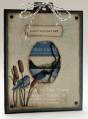
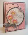
I am discovering masculine sympathy cards are not my forte! I start off with a grand plan, but it takes on a life of its own... I was aiming for soft and serene, but ended up with bright and happy. Drat.
Colored with copics, glossy accents on the bird. Background embossing panel centre oval die cut was used for the main stamp feature, recessed into the card front. Flower is Kitties style: punched, embossed, layered. Smooch in the flower centre, & a rhinestone added.
Paper pierced along bottom edge...every 4th hole punched.
Date: Tuesday, September 20, 2011 GMT Views: 5058
Favorited:44
Registered: September 29, 2009 Location: CraftRoomWorkingHard(not) Posts: 2809
Wed, Sep 21, 2011 @ 9:58 AM
It's not bright and happy to me. I think it's kind and thoughtful and is offering a sense of peace and caring. I think it would be fine to send for the occasion.
Registered: August 18, 2008 Location: Belfast, Northern Ireland, UK Posts: 31972
Wed, Sep 21, 2011 @ 3:23 PM
Yes, your little bird is beautifully bright, but not TOO bright - I love this little scene, and it's framed gorgeously with the embossing - wonderful sympathy card.
Registered: February 3, 2005 Location: Delray Beach, FL Posts: 34769
Sun, Sep 25, 2011 @ 7:10 PM
Oh, this is beautiful and serene! The bird is beautiful...definitely not too bright! I think it's perfect...and remember, sympathy cards should be uplifting! TFS!!
------------------------------ Cheryl
Proverbs 3:5-6 My blog
Registered: August 17, 2008 Location: Queensland, Australia Posts: 6826
Tue, Oct 04, 2011 @ 12:08 AM
The card might not be what you set out for it to be, but it's still a great card. I love the bold colouring and the glossy accents. I really like the way you used this stamp coming out of the water.
------------------------------ Theresa Visit my blog In All My Glory