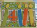
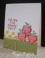
I don't DO bright colors, so this is my compromise. A little bit of four bright colors and A LOT of WHITE!
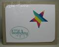
For the "popped up" part, the strips of paper are stuck to another piece beneath the top layer, so the top layer is raised quite a bit off the base of the card. I'm taking that as the whole white layer is "popped up".
Date: Friday, July 29, 2011 GMT Views: 1164
Favorited:4
Registered: May 6, 2008 Location: Bay Area, CA Posts: 717
Fri, Jul 29, 2011 @ 5:53 PM
Ooooh! So pretty! Love the bright "pop" of color of your star with the all white background. Gorgeous!
------------------------------ Lisa papergrace designs * My SCS Gallery *Faber-Castell Design Memory Craft� DT*Scrapbook Adhesives by 3L� DT * "Creativity is intelligence having fun." - A. Einstein
Registered: April 6, 2006 Location: Las Vegas, baby! Posts: 14934
Sat, Jul 30, 2011 @ 3:25 AM
I'm going to go with "Today is Opposite Day", so it only makes sense that the card would be popped up, not the accent... :-)
Wonderful CAS card, and I love that there's "just enough" of the bright colors...
------------------------------ ~ Sue Happy for no reason...