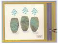
This combines elements I liked from several cards, none of which worked out quite as planned! I wanted to do a panel something like mayodino's, but on the piece of paper I was using it turned out the branch on the left didn't really fit. The diamond backed button idea I got from a card by mjm. I used a scrap from something I'd done with Looks Like Spring, and after smudging the "good" side, decided to use my test side with the other stamp--although the colors weren't right, I liked how it looked on the edge. Elements from krzykramer were the flower background and different color wing. I'd planned on a blue wing (making it vaguely jayhawk-like), but my color combo evolved differently! The flower background turned out basically as planned, except one section wasn't inked well--corrected some, then decided I liked a white strip on the right and cut of part of the bad area.
Date: Thursday, February 3, 2011 GMT Views: 901
Favorited:3
Additional Info
Stamps: Spring Solitude, unknown message, Looks Like Spring (accidently)
Paper: Soft Suede, Red Ridinghood Red, Marigold Morning, WW
Ink: Basic Gray, Red Ridinghood, Soft Suede, Marigold Morning
Registered: April 18, 2009 Location: Boston suburbs, MA Posts: 14060
Thu, Feb 03, 2011 @ 7:05 PM
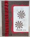
This is really pretty, Katie! I love how you layered the clear square button over the square of designed paper, and the fringed end of the sentiment panel looks so cool.
------------------------------ ~ Emily ~ My BLOG
My kids are on SCS: ponyluvingirl (age 14) and Legoboy (age 10)
I'm a Punchkateer! ~ I design for DeNami Design Rubber Stamps
Registered: October 12, 2007 Location: Arizona Posts: 70173
Fri, Feb 04, 2011 @ 7:30 AM
Nice! The clear button is a great addition here. It inspires me to pull out the ones I have and use them! The fringed edge looks great. I like that. Need to try it. I like how you layered the marigold CS for the main image. It looks different to not use a whole piece. Nicely done. Into my favorites - I need to see this one again. TFS