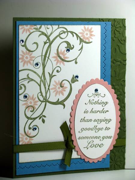
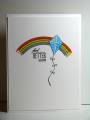
I find blue and pink really hard to put together so this color challenge was really difficult for me. On a non-color-challenge day, had I been making this card, I would have used a deep rose instead of the blue. But that's why I like color challenges - I think the touch of blue is really nice and I never would have done it on my own!
Kim
Set 176 for my 2010 goal of making sure that all of my SU sets see ink.
Date: Tuesday, September 14, 2010 GMT Views: 1673
Favorited:17
Registered: April 27, 2007 Location: South,GA Posts: 59576
Tue, Sep 14, 2010 @ 6:07 AM
Hey your really knock down those sets this year. I need to try this next year but I am dusting mine off and using them since I rearranged my crafty cave. this is gorgeous just like it is. I love set and need to use mine too.
Splitcoast Dirty Dozen Creative Crew SU Design Team Alumni
Registered: January 7, 2007 Location: Southern California Posts: 42754
Tue, Sep 14, 2010 @ 6:45 AM
To me, this has a great balance of colors. The baroque swirls are always so elegant but I never thought to use it for a sympathy card. This is just gorgeous, with a great image, great layout and nice textured panel. The sentiment is so touching. I just hope you don't need this any time soon.
------------------------------ Kathy Stamp n Sip with me
Registered: May 18, 2005 Location: Northern MN woods Posts: 11652
Tue, Sep 14, 2010 @ 6:53 AM
Great idea & details ~ TFS!
"The unfailing love of the Lord never ceases, by His mercies we have been kept from complete destruction. Great is His faithfulness; His mercies begin afresh each day." Lamentations 3:22, 23
------------------------------ ~ Carol G.
"The Lord is a Mighty Savior who rejoices over you with great gladness. With His love, He will calm all your fears and exult over you by singing a happy song."
Zephaniah 3:17