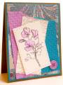
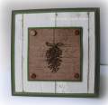
I think these colors look better in real life. The embossed pieces are actually orchid opulence and teal. They photographed more of a pink and blue. I guess it's the irl that matters most for the receiver of this.
Date: Monday, September 6, 2010 GMT Views: 539
Favorited:2
Registered: May 10, 2006 Location: Westminster, CO Posts: 27878
Mon, Sep 06, 2010 @ 7:51 PM
Yeah, for you! You got to play. I am jealous. What a lovely creation. I like that dp in the back and then your textured and torn layers.......all at an angle with the french script, too. As always, lovely watercoloring.
------------------------------ Be the reason someone smiles today!