Registered: September 4, 2005 Location: Manassas, Virginia Posts: 616
Thu, Jan 05, 2006 @ 9:16 PM
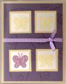
Pure honesty: I like the concept of the card, but something is just not right - maybe the ribbon is the wrong color?? I don't know - I am interested to see what others have to say.
------------------------------ Gina
Mom to Justin (6 years), Katelyn (3 1/2years), and Logan (19 months)
Splitcoast Dirty Dozen Alumni Splitcoast Gallery Moderator
Registered: July 19, 2004 Location: Colorado Posts: 24169
Fri, Jan 06, 2006 @ 6:22 AM
Honesty: I agree with Gina. I love the concept (I always like the "which one is different" kind of design). I too think it is the ribbon -- but it may be just the way the scan came out? You could try the thin white organdy.
Registered: September 18, 2003 Location: Warwick, RI Posts: 1229
Fri, Jan 06, 2006 @ 6:40 AM
Hmmm...I like the "one of these things is not like the other idea," but in this case, I think the purple butterfly is just too different. I think it would work to have the upper right butterfly be purple also--that would tie it together well, I think. Purple and yellow are a great color combo, and my college colors!
Registered: September 13, 2004 Location: In my Happy Place with no one bothering me....I hope! Posts: 13877
Fri, Jan 06, 2006 @ 8:36 AM
Honesty: I think the yellow mats under the butterflies could be textured (DTP or canvas) and that would really help. Then maybe a "you are one of a kind" sentiment! I do love the color combo and the concept!! Great job!
Art is intended to provoke an emotion from a total stranger. If you�ve succeeded in this, consider yourself an artist. Paper Shanks Blog. Love me or hate me, you are still talking about me
Registered: November 6, 2003 Location: Omaha Posts: 3430
Tue, Jan 10, 2006 @ 5:24 PM
I think this is a cute card... for my personal tastes I would change the butterflies so they were all the same, maybe the solid stamp in yellow and then the outline one done in the purple? i don't know if that would look good or not though!