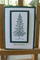
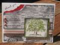
Well no, the card isn't quite a mess, but with all the experimenting my desk and fingers are. Julia's challenge this week was to use heat embossing. My card is a sort of variation on the faux bleach in the resources, or the faux batik the colorwash way we once had as a TLC.
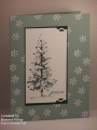
I tried watercolours on plain card and watercolours on watercolour paper but the colours came out too soft for the look I wanted. Then I tried alcohol inks on glossy card, but I didn't get a flowing effect. So then I tried misting the glossy card first with Alcohol Blending Solution and then adding drops of ink, and that gave me the best result. This was after I'd stamped my image with Versamark and embossed with clear EP. Then I ironed it between sheets of scratch paper till the EP had melted out of it. Trimmed, mounted on black and then on green Bazzill. Couldn't think what to do next - DP would take away from the panel. Buttons didn't look right. Photo corners didn't look right. So I just scored a double border and that's it - if nothing else it's a handy masculine card.
Date: Thursday, June 24, 2010 GMT Views: 1990
Favorited:15