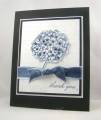
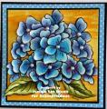
The playdate cafe challenge this week was to create and black and white card with a touch of blue. I decided to go the navy route as opposed to my original thought of a much brighter blue.
I mixed the focal image from Because I Care with a sheet of DSP from Night and Day and Basic Black, Whisper White and Night of Navy card stock.
the image was inked with my Night of Navy marker. I snipped around the image and mounted it onto the DSP with dimensionals.
The ribbon is actually Whisper White. I used my marker to color it with Night of Navy ink. I didn't want it perfect, as I wanted to keep with the theme of the imperfections on the dsp.
If you would like more info, sizes, etc. you can get more detail on my blog at this post can vintage be clean and simple
thanks so much for stopping by
jaydee
Date: Tuesday, June 22, 2010 GMT Views: 1263
Favorited:39
Splitcoast Dirty Dozen Creative Crew SU Design Team Alumni
Registered: January 7, 2007 Location: Southern California Posts: 42915
Sun, Jun 27, 2010 @ 8:06 AM
So glad this was listed on the CAS favorites or I would have missed it. Simply stunning. Amazing coloring, fab color theme. Love the cutting out of the hydrangea, but can't imagine that was easy. The velvet ribbon takes it over the top.
------------------------------ Kathy Stamp n Sip with me
So beautiful and rich looking! Love how you did the ribbon.
------------------------------ Linda E
Caution: You are entering an artistic zone. This is not clutter - this is creating. These are not pajamas - it's my work uniform.