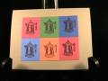
Thank you, Cav, for the challenge to create a pop art card. I'm so glad that Sarah put up some pictures from the computer, because I didn't quite get it. Then I remembered that I had done an Andy Warhol card several years ago. So, I did it again. I used an image from the past, left off the pun and I really like my bright card.
I chose some colors that will be gone soon: ruby red, brilliant blue, ballet blue and only orange. This color combo is straight from the color coach.
Thanks for looking.
Date: Wednesday, April 7, 2010 GMT Views: 946
Favorited:11
Registered: January 29, 2009 Location: Colorado Posts: 137
Sat, May 01, 2010 @ 11:53 AM
I really like this card. I was thinking it would be hard to get uniform rectangles, but found that my square punch provided the perfect size...and it is easy to center the image when you use a punch AFTER you have stamped. I sat down to do one card like this, but had so much fun and liked the outcome so much that I made 3. It was an easy way to feature some retiring Stampin' Up! colors. I think this would make a great stamp-a-stack project. I used River Rock for my background paper and it provided a nice backdrop. I think I'll go back now and make some more cards like this with the other stamps from Puns from the Past. TFS. I never would have thought of using this stamp set this way if you hadn't shared.