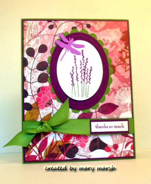
this is my card for tuesday's color challenge. this week betty chose old olive, rich razzleberry and orchid opulence.
these were such great colors to work with.
my dsp is from basic grey. their indian summer collection is such a perfect match for su's current in-colors.
I used some old olive satin ribbon from su.
The orchid opulence requirement was fulfilled by punching a dragon fly out of that color. I have never used this color before.
My image is from the pocket silhouettes stamp set.
Registered: April 26, 2006 Location: Maple Grove, MN Posts: 6670
Tue, Mar 16, 2010 @ 9:54 AM
So pretty - what a great card. (I was thinking I had maybe never used Orchid Opulence either, but I found some scraps of it, so I guess I was mistaken! )
Registered: November 3, 2005 Location: Fairport Harbor, OH-IO, Lake Erie shoreline Posts: 59967
Tue, Mar 16, 2010 @ 5:01 PM
Pretty DP on this pretty card. I was thinking I've never used OO b/f either, but there were pieces in the folder. I keep a manilla folder behind every color just for scraps.
------------------------------ Karen ~ Thanks for stopping by my gallery. Proud Fan Club Member - FS525, QFTD49 Life is better in a beach town!


 )
)


