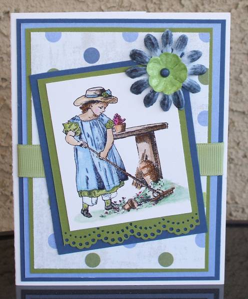
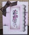
This challenge calls for opposites. I used my newest paper which is enchanted evening by Papertrey Ink and my oldest paper which is the dotted bg paper that I had since the days when I use to scrapbook. Putting flowers on cards is my least favourite embellishment. I like the colours of papers I used, even though the saying goes that blue and green should never be seen. I think in this case they look lovely together... What do you think? TFL Oh, I feel so foolish.... I totally misread what was required on the challenge. I thought those 4 items were just examples and not actually what we had to do. I think that I am the only one who misread it. so, so sorry......I will take my time and read it better next time.....
Date: Thursday, September 10, 2009 GMT Views: 338
Favorited:2
Registered: September 14, 2006 Location: Omaha, Nebraska Posts: 2607
Fri, Sep 11, 2009 @ 11:33 AM
Your card turned out so sweet! I love the colors you used together. Blue and green go very well together--look at a tree against the sky--not to shabby right? I really like how you tilted your main image panel. It give the front of the card real interest. TFS