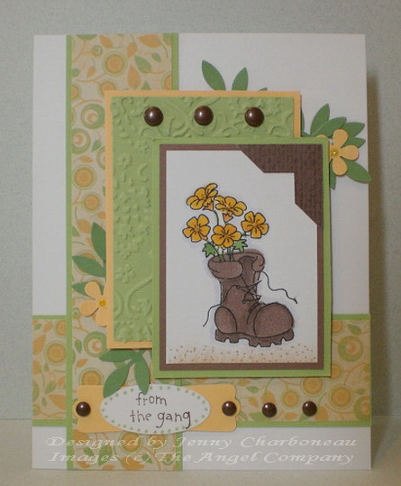
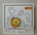
This is my make-over card. What I really didn't like about the first card:
* too much apricot & not enough green to bring the eye to the main image.
* too much glitter detracting the eye from the main image.
* the choice of punches over-whelmed the image.
I think there was a pattern! I love this new image from TAC. Actually it's not new. It was a special blast from the past promotion. And since I really wanted this small adorable image to be the center of attention, I needed to make some changes. Here's the original card that I dismantled: Gallery at Splitcoaststampers
Stamps: Something for You (The Angel Company)
Paper: white, certainly celery, wild wasabi, apricot appeal, unknown SU dp (photo corner punch/Wish RAK), DCWV dp
Ink: Memento tuxedo black, creamy caramel, Palette burnt umber, certainly celery, crushed curry (under the Stickles), Copic markers (E74 Cocoa brown, E71 Champagne, Y38 Honey, Y35 Maize, G24 Willow, C-1 cool gray)
Accessories: brads, SU photo corner, small oval & modern label punches, EK Succes small flower punch, Martha Stewart leaf punch, CB embossing folder (name?/Wish RAK), dimensionals, sponge, Diamond Stickles
If you're interested in seeing more of my work on my blog or you would like to see what I put in my favorites, here's the link to my blog. This isn't a direct link to this card. http://designsbyboo.blogspot.com/
Date: Tuesday, August 18, 2009 GMT Views: 1796
Favorited:9
Registered: January 29, 2006 Location: Mount Forest,Ontario Canada Posts: 11551
Wed, Aug 19, 2009 @ 4:35 AM
CUTE BOOT!! Just came to mind and it rhymes too!! The paper and colors are sweet and you've achieved a wonderful balance which is what it seems like you felt was missing with the first, tho I think you've created two cute boots!!
------------------------------ Michele
My God shall supply all your need…Philippians 4:19