Registered: December 29, 2008 Location: Novi, MI Posts: 1972
Thu, Aug 06, 2009 @ 6:18 AM
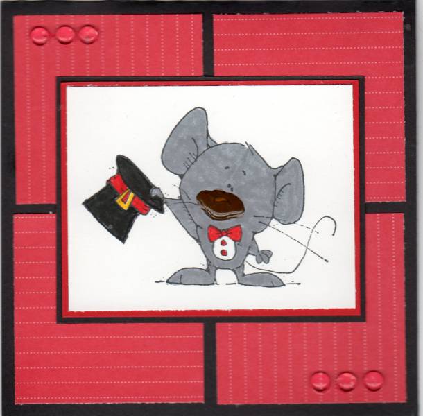
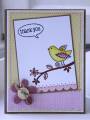
Your card caught my eye because of the way you mixed the direction of the lines in your dp. I initially thought it was a textured background. Looks good. TFS.
Registered: October 12, 2007 Location: Arizona Posts: 70170
Wed, Aug 19, 2009 @ 1:10 PM
Cute card. I agree with the others, I like how you turned the DP so the lines are going opposite. Like the layout of 4 blocks. Red is a good contrast or accent color for the gray mouse. He's cute standing there tipping his hat. TFS