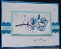
This is one of two cards I made with a "more is more - less is more" approach. Which one do you like best? This one is my entry to the Flourishes July challenge, "By the Sea". I chose colors that remind me of the ocean, Cool Caribbean and Pacific Point for coloring the flowers with a blender pen. Then I sponged around the image with Soft Sky.
It doesn't show up very well in the photo, but I stamped the image twice, cut out a couple of the flowers and put them on pop up dots on the other image to give the sweet peas some dimension.
Date: Wednesday, July 8, 2009 GMT Views: 1265
Favorited:24