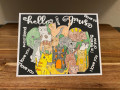
ATC swap where we were to emphasize what it was about the paper that we liked so much. At first I found this to be an incredibly challenging concept. However, once I realized that I was making it more complicated than it needed to be I decided I would do as required, explicitly, simply and succinctly (if visually possible). So these are very simplistic but I like them for it.
I decided I wanted only one element per card, but that I would bring it into focus by raising them up off the cards.
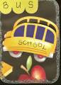
I thought this paper was So CUTE for doing school themed scrapbook papers but was uncertain whether I liked it with the black background or the navy background so, I got both (and honestly i still cannot decide). I thought the bus, the way it's curved and cartooning was quite fun but I could not simply cut one out and raise it up (I certainly wouldn't find a schoolbus as cute to put on the card) so having both colors of paper was perfect. I used the black paper for the card and then emphasized the bus by cutting it from the blue, offsetting it with the black so it was obvious there was a little something going on, in fact a kind of double-vision feeling about it.
The blue papered bus is really quite noticeable in your hands. But it still needed more. So I used some of that pre-fab scalloped green border (that matches the apple leaf) to further indicate that the focus of the paper was the schoolbus. But it didn't look good all by itself so I realized that I needed more round. I had the round bus, the round apple, the round scalloping so I needed round corners. Three of the four corners are rounded off and then Stickles in silver was applied around the card to frame it. The school bus was my favorite element of the paper, although the entire paper is way cute!
Date: Thursday, March 19, 2009 GMT Views: 138
Favorited:2