Registered: June 19, 2004 Location: In my own little world ! Posts: 2117
Mon, Jul 04, 2005 @ 6:32 AM
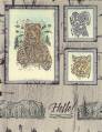
It's a good first start. I like your layout and your colors. I wish I could demo this set. I usually do one lighter shade when I do DTP that way if I over do it is not as noticeable.
Registered: May 27, 2004 Location: In between corn and commerce. Posts: 3575
Mon, Jul 04, 2005 @ 10:12 AM
OMGosh, OMGosh, OMGOSH!!!!! I don't comment on cards unless they strike me to begin with, but your card is **SO TOTALLY GORGEOUS**!!!!! And *NO*!!! It is *not* too shabby and I don't think that you got carried away with DTP!!! I absolutely *LOVE* it!!!! I'm going to CASE it...but not for a card, for a layout for my s/b that has an intense foreground of sea oats with an intense b/g of flowers and your layout would perfectly capture that - you've inspired me!!!!! Thank you *SO* much for sharing you *GORGEOUS* creation!!!!! ~ Kaylyn
------------------------------ Hi...My Name is Kaylyn...I'm An Alphaholic.
[B]
Registered: May 1, 2005 Location: Mostly near Cincinnati but Gulf Shores, AL in the wintertime 😎 Posts: 945
Sun, Jul 10, 2005 @ 5:21 AM
How pretty! Too bad this set didn't make it into the new catty. :( And I don't think this is overdone with the DTP at all. (Geez, you should see some of the DTP disasters I've cranked out!) This is a creation to be proud of! ~TFS~
stampingnut
------------------------------ "God is good, all the time. All the time, God is good!"