Registered: September 26, 2006 Location: Melbourne Australia Posts: 1122
Sun, Mar 08, 2009 @ 9:35 PM
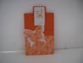
I find orange a hard colour to work with but you have inspired me to start with just adding it to white.
I like your dp, flowers and butterflies are always a sure thing.
------------------------------ Kathleen My Gallery
Registered: November 3, 2005 Location: Fairport Harbor, OH-IO, Lake Erie shoreline Posts: 60139
Sun, Apr 12, 2009 @ 6:01 PM
Orange is a hard color to use. I like what you did here. The butterfly is pretty neat.
I'm lucky that the grandkid's school colors are orange and brown - makes it a little easier!!
------------------------------ Karen ~ Thanks for stopping by my gallery. Proud Fan Club Member - FS525, QFTD49 Life is better in a beach town!
Registered: June 9, 2006 Location: Wauconda, IL Posts: 55666
Sun, Jun 21, 2009 @ 6:33 AM
Hi Valda! Great card!! I love how you have made the butterfly out of two different dps. I also really like the white and orange; it has a clean and simple look to it.