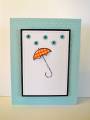
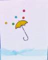
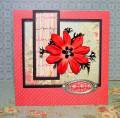
I cased my own card shown here:Friendly Umbrelly by lisa lara at Splitcoaststampers. I thought there was just too much white, too big of area for the image. So I gave it another try this time using a blue background with Swiss Dots CB folder and a smaller white rectangle matted with black. I tried these shinier eyelets and stitched instead of using ribbon. And used PP for the umbrelly. What do you think? Better than the first? I like my first because of the rainbow eyelets but I like this one for its compactness (does that make sence?). TFL
Date: Wednesday, February 4, 2009 GMT Views: 1686
Favorited:18
Registered: June 14, 2007 Location: Somerset, NJ Posts: 577
Wed, Feb 04, 2009 @ 4:01 PM
I love this card! The colors really pop. My sister gave me this set about a year ago...she never used it...then I never used it.....now I am inspired to! TFS!
Registered: June 14, 2006 Location: Bellevue, WA (Seattle 'burbs) Posts: 4292
Wed, Feb 25, 2009 @ 9:24 PM
I really, really like them both. If I HAD to choose, I'd probably go with this one. Black/white/light blue is my all-time favorite combo, it's just such a clean look, so that's why I'd choose this one.