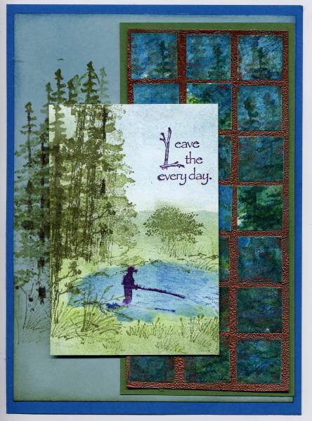
This is my first attempt at using the scenery stamps I ordered from Art Impressions months ago (I finally got around to mounting them). I used a card I saw in the gallery at artimpressions.com to help me. I first sponged Baja Blue and Pacific Point for the lake, Garden Green for the grass, and Baja Blue for the sky, then stamped the trees, grass, fisherman and water ripples. The tiles in the faux mosaic are actually cut from a piece I found laying around when I was reorganizing my stamp room (finding treasures like that are always a good incentive for me to clean!). The technique I used on it was the melted crayons background. The melted crayons gave the piece some texture and just a little bit of sheen -- which I thought was perfect for mosaic tiles. I stamped more tree images on the crayon background before I cut it up into tiles. I'm not sure I like the copper EP because it seems to draw your attention away from the lake scene...what do you think?
Date: Wednesday, January 28, 2009 GMT Views: 2244
Favorited:16
Registered: August 22, 2005 Location: Beautiful British Columbia, Canada Posts: 1225
Mon, Feb 09, 2009 @ 11:09 AM
Very cool. I really like your card! I love how it looks like a watercolour painting and how you created interest by stamping of the image onto the card stock. Your scene is great! I agree the melted crayon adds wonderful texture and works well with the trees stamped over top. I think the copper does pull your eyes to it a bit but your image is so great I keep looking at it.
------------------------------ Treena
My gallery: ink|outside|the|box "My brain has a mind of it�s own.�