Registered: February 14, 2005 Location: BC Posts: 1261
Sun, Jun 12, 2005 @ 10:49 AM
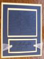
What a neat color combo. I never would have thought of it. Now I have to pull out that taken with teal and experiment! I agree that the garden collage is a nice choice for a wedding card! Thanks for sharing this! Good job!
Registered: July 16, 2004 Location: in a virtual revolving door Posts: 79173
Sun, Jan 08, 2006 @ 7:04 PM
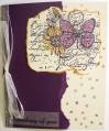
Brutal honesty: You did an excellent job coloring the main image. I like the curled ribbon - it's an unexpected twist on the usual bow (pun intended ;) ). I'm not sure I like the coral with the teal, though. Maybe if you had flip-flopped the colors, so the teal was behind the main image, and then instead of coral at the bottom, if you'd used a purple to coordinate with the flower... anyway, those are just my thoughts. Overall it truly is a very nice card.
Registered: February 23, 2005 Location: Red Sox Nation Posts: 12105
Sun, Jan 08, 2006 @ 7:31 PM
Honesty thread: I like the layout of the card, but I'm not sure about the colors. The twisty ribbon is fabulous! I think I would have moved it down a tad so the reveal of the mat is even all the way around.
------------------------------ Debbi - SU Demonstrator My SU Website
Visit me on Facebook
Registered: November 6, 2003 Location: Omaha Posts: 3430
Wed, Jan 11, 2006 @ 11:38 AM
honesty thread: VERY PRETTY! I agree that the ribbon should be moved off the coral mat and lowered so it is on the teal part just above the sentiment or layered underneath it? just a thought