I have such problems editing my gallery to change the photo - it seems to take days and then sometimes it only changes part of the displays. So I am going to post a Take 2 on this card.
Registered: April 6, 2005 Location: Stuarts Draft, Virginia Posts: 14401
Wed, Oct 29, 2008 @ 8:58 AM
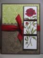
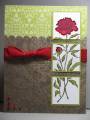
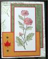
Great take on the challenge to split up the image into 3 sections!!
------------------------------
Wanda Cullen ~ Dirty Dozen Alumni, On design team for Papertrey Ink, Designer for Color Throwdown and Fusion Card Challenges Cullen-ary Creations[/URL]...my blogHERE'S MY GALLERY[/URL]
Registered: August 1, 2006 Location: Missouri Posts: 26795
Wed, Oct 29, 2008 @ 9:07 AM
Both of your cards are pretty, but this one is my favorite. It is amazing how just changing the kiwi kiss to the chocolate chip made a world of difference. I love how you split the image up into the squares.
Registered: November 5, 2007 Location: Hamilton, ON, Canada Posts: 13629
Wed, Oct 29, 2008 @ 9:19 AM
I agree - both cards are pretty, but changing to the Chocolate Chip mats really makes your image POP! So this one is my favourite out of the two! BEAUTIFUL!
------------------------------ ~ Laurie Proud Fan Club Member
Registered: August 8, 2006 Location: Roseville CA Posts: 18519
Wed, Oct 29, 2008 @ 9:24 AM
this is lovely. in comparing it to the original, i totally agree with the chocolate chip layering AND the placement of the background scallops. the first version made it look like that bud was going to be chopped off. (mind you, that came to me only because i was comparing and trying to see which "proportion" you were talking about).
Registered: April 9, 2007 Location: Parker, CO Posts: 1392
Wed, Oct 29, 2008 @ 9:36 AM
Serenity_Stamper was dead on. I just couldn't figure out what was wrong with my first card - but as she said, it does look like the bud was going to be chopped off. Next time somebody (DH!!!!) tells me that I am obsessing over a card, I will remember that 1/4 inch of paper made a HUGE difference on this card!!