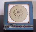
You know how sometimes people write with their cards that they look better IRL? Well, this one looks WORSE in real life. I'd love some suggestions! I cut the oval with my Creative Memories oval cutter and stamped the sentiment inside. Stamped the flowers black and added the ribbon. Since it was so boring, I painted with glittery paint the inside of the oval and then decided to paint on top of the flowers, too. Since I was using the cut oval as a template for painting, I accidentally got some blue on the outside of the oval on the white paper. Out came the CB and nesties to make a scalloped oval to cover it up. If you have suggestions, I am all ears because this card really really needs it! TFL
Date: Sunday, October 12, 2008 GMT Views: 571
Favorited:5
Registered: December 25, 2005 Location: Drinking in God's Good Grace...! Posts: 42119
Tue, Oct 14, 2008 @ 2:25 PM
I think this card is very nice! I like the L/O ...the ribbon, and the colors! TFS!~
------------------------------ "God designed the human machine to run on Himself. HE Himself is the fuel our spirits were designed to burn..." C.S. Lewis, Mere Christianity
Registered: July 13, 2004 Location: Wishing I lived closer to my kids! Posts: 61028
Tue, Oct 21, 2008 @ 5:36 AM
I like the blue and black together too -- the painting on top is a neat look! You could add some white dots with a gel pen in your scallop frame to match your ribbon -- or (I love brads) add a row of three vertical in the bottom left corner. Maybe four even, if you had matching blue and black - and alternate them!