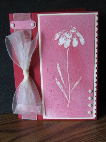
Just had to do this again, now that the shock has worn off, and my DH is able to sit up and take nourishment after seeing the iron. He now understands that ALL appliances relate to stamping, or they are disregarded.
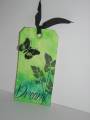
For some reason, this paper is VERY absorbent....the color even got UNDER the clear embossing. I kinda like the way it looks.
This of course started out to be RED, but I guess I used too much water. Just pretend it's RED, for my sake. Oh, and the bar and brads across the ribbon at the top, well there's one at the bottom too...sorta hidden by the bow from this angle.
Thanks for looking.
Date: Monday, September 29, 2008 GMT Views: 872
Favorited:6
Registered: October 23, 2005 Location: well, duh! Posts: 13519
Mon, Sep 29, 2008 @ 11:33 AM
lol...love your iron comment! This is a beautiful card with such stunning colors, even if it didn't turn out as red as you would have liked...I love it. Fabulous job.
Splitcoast Dirty Dozen Alumni SCS Gallery Moderator Splitcoast Challenge Hostess Teapot Tuesday TEAm
Registered: July 27, 2007 Location: Dublin, Ireland Posts: 131398
Mon, Sep 29, 2008 @ 11:38 AM
Yeah, the blue got under me EP first time round. I liked the look too.
That's a really cool ribbon treatment too, must remember that for the rare times I use wide ribbon!
Registered: July 27, 2007 Location: in the beautiful U.P. Posts: 2252
Mon, Sep 29, 2008 @ 12:00 PM
Very pretty..I like the ink on the petals, too..just like real flowers! (PS..my DH was wondering what I was ironing next to the kitchen sink..paper of course!)
------------------------------ See you in August 2012!!