Registered: March 17, 2006 Location: Heaven - Buried under a mountain of paper scraps and stamps! Posts: 2069
Mon, Sep 15, 2008 @ 6:29 AM
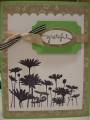
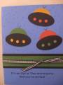
I like this one better, not sure why. Ribbon looks better lower on the card. TFS
------------------------------ "Promise me you'll always remember: You're braver than you believe, stronger than you seem, & smarter than you think."-- Winnie the Pooh MY BLOG in progress
Registered: June 17, 2008 Location: Victoria, Australia Posts: 1455
Wed, Sep 24, 2008 @ 6:20 AM
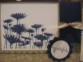
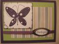
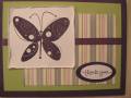
I liked this one best as it looked more polished & finished off better. Having the ribbon lining up with the words & the words framed makes it look like a lot of thought & extra effort has gone into it (even when it may not have). Also, by running the ink around the edge of the Butterfly block you have drawn our attention to it more, which didn't happen in the other layout. This one is cohesive, elegant, & beautiful done. The other is also beautifully done but it just doesn't have that 'polished' look about it. HTH
------------------------------
The task ahead of us is never as great as the Power behind us. - Amen! Fan Club Member