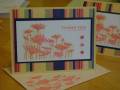
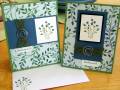
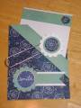
i took my cue from this patterned paper. i did the rock and roll technique with bayou blue and old olive. i wasn't sure that i liked the sketch on the left, it felt heavier on one side, so i added the piercing, but still didn't care for it. so i changed it up on the other. if you will tell me what the right one needs, i would love some feedback. thanks.
Date: Thursday, September 11, 2008 GMT Views: 1357
Favorited:23
Registered: July 4, 2008 Location: BBC - Beautiful British Columbia Posts: 446
Thu, Sep 11, 2008 @ 9:00 PM
If you off set the centre panel...slightly at an angle, maybe to the right. It's hard to describe this thought. But it seems kinda too square, angular??, maybe it needs to be a bit whimsical..like the flowers. Just a thought.
Otherwise the stamping and colours match the dp perfectly, really like what you did with the ribbon and the metal embellishment. Gonna CASE this for sure. TFS
Registered: April 12, 2005 Location: Alberta, Canada Posts: 2149
Fri, Sep 12, 2008 @ 6:42 AM
I think both of them are great. The piercing added to the left one - but it's a great way to show how to use the same pieces and have two different looking card. Love them both.
Registered: February 15, 2006 Location: New Hampshire Posts: 3340
Sat, Sep 13, 2008 @ 4:57 PM
Wow, love these and the colors you chose. The RnR technique works great with this...for the sketch on the left, if you keep the image and border the same but try making the left hand side not quite as wide, I think it might be less "heavy". Just a suggestion, I think they're both beautiful.
------------------------------ ~Holly
"Rejoice in the Lord always. I will say it again: Rejoice!" Philippians 4:4
Registered: July 22, 2007 Location: Virginia Posts: 47
Sun, Sep 14, 2008 @ 7:11 AM
I think the right one is great! You might try adding a white layer behind the blue bayou to create a 1/8 border. I've found when working with dark colors adding that extra mat with a lighter color really helps it pop more.