I am NOT an artist.
I cannot even draw a stick figure that looks right.
But...even so...I am passionately in love with Copic markers. I am a very simplistic user of Copics but they are so easy to use that even my simple methods look good.
I have not been trained nor certified by Copic, but I have gathered information from the many Splitcoast forums and from many blogs. So, although I am not an expert, I do feel qualitifed to gather all of this information into one post! Thanks to all of you for the information that you have shared.
WHAT ARE COPIC MARKERS?
Copics are alcohol based markers...as compared to Stampin' Up or Tombow markers which are water-based. The alcohol allows to fully saturate your paper thus making it easier to develop rich colors and to blend colors.
Copics come in Original, Sketch and Ciao. You don't want the Originals as they only have a broad tip and fine tip. Sketch and Ciao have a brush tip which allows you to color.
If you do any shopping you will quickly see that the Copic Ciao markers are significantly cheaper than Copic Sketch. I started with Sketch markers so kept going in that direction. The explanations that I can find are that Ciao markers "offer all the features of the Sketch Marker, but in an economical size" - obviously a little vague. Frankly, I haven't explored any more than that because the one BIG difference for me is that Ciao markers come in only 180 colors while Sketch markers come in 346 colors and I am totally obsessive about matching colors!
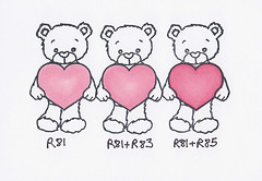
Copics color are identified with a letter and a two-digit number.
The letter defines the color, e.g. R = reds, YG = yellow/greens.
The first number identifies the family within the color. The second number identifies the lightness/darkness.
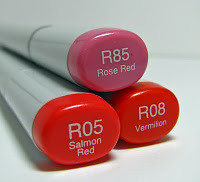
For example, the markers R05 and R08 are both reds, they are both in the same family because of the first "0", but the R08 is darker than than the R05. R85 is also a red but it is an entirely different family based on the first "8" and is not comparable to the first two.
CAN COPICS DO EVERYTHING A WATER-BASED MARKER CAN DO?
Copics cannot be used to color directly on stamps. They dry too quickly for you to apply multiple colors.
(FYI - having said "don't do it", I have seen technique videos coloring on stamps, but it is a royal pain!)
INK AND PAPER
If you are a brand new user - you should know that the ink with which you stamp and the paper on which you stamp do make a difference.
1. Do NOT use alcohol ink pads like Staz-On. Copics are alcohol-markers and they just smear the ink. Use a dye ink, virtually all of them work - Memento is consistently mentioned as the best brand and I do have good luck with it.
2. Do NOT use glossy or semi-glossy paper. Copics need to be able to sink into the paper for full coverage. There are many that work - Neenah Classic Crest is regularly mentioned as the best. Sweet 'n Sassy does carry 25 packs - find it
here.
COVERAGE AND SHADING
Today, I want to talk about two fundamental coloring tips for Copics - coverage and shading.
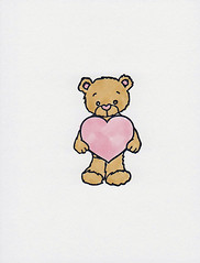
Check out little Rhubarb - he's cute, but he has some issues. (Actually...he's perfect, but my coloring has some issues!)
 COVERAGE
Notice how you can still see the streaks on this image. You can solve this in two ways.
1. Color in circular strokes - you can avoid those long streaks.
2. Saturate the paper - you WILL see the color on the back and that is GOOD!
 SHADING
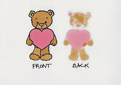
The other thing that you might not notice at first glance is that Rhubarb is really "flat". You can solve this with two types of shading.
(At this point, I feel compelled to remind you that this is Copic 101 - there are amazingly advanced Copic users out there who give instruction on realistic shading using light sources, and shading with four or five colors for incredibly realistic effects, etc. It is beautiful! But I am here to tell you that you can do fantastic work with these simple techniques.)
1. Use darker or more color at the inside edges of the image to give it that rounded, dimensional look.
2. Add a light "shadow" around the entire image to pop it from the background.
Let's talk about that darker color on the inside edges.
One of the huge advantages of Copics is their ability to blend. You can easily accomplish a seamless blend of color by:
a) coloring your entire area with the lighter color
b) add a darker color around the edge (don't forget your circular strokes)
c) go over the entire thing again with the lighter color
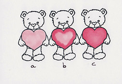
If you are new to Copics, you may be realizing that I am suggesting for every color you own, you need a second darker color - $$$$ - it adds up! But you can do this shading with one color pen and I definitely recommend you start that way. You can also do it with pen slightly darker or with a pen quite a bit darker and that becomes personal preference. Here are the variations:
As you can see, you still create shading with ONE pen!!
The other type of shading is around the outside to pop it from the page. You can use the lighter grays, blues or yellows and simply draw around the outside edge. Check out these before and after pictures. The first Rhubarb bear still looks flat - but the second one comes alive...and all I did is color around the outside with a little gray!!

And here is the final result...
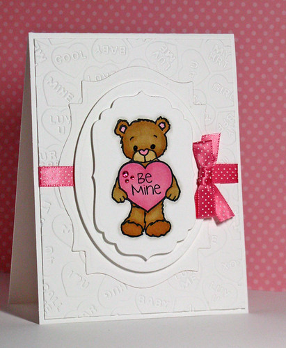
BONUS: Did you notice the gems on the card? Did you notice that they matched? Gems and pearls can be colored with copics!!! Once you get a collection of Copics, you never have to buy a colored gem or pearl again!
I hope you enjoyed your time in Copics 101!


