Splitcoaststampers.com - the world's #1 papercrafting community
You're currently viewing Splitcoaststampers as a GUEST. We pride ourselves on being great hosts, but guests have limited access to some of our incredible artwork, our lively forums and other super cool features of the site! You can join our incredible papercrafting community at NO COST. So what are you waiting for?
Need help sorting my SU! colurs into ROYGBIV order.
My story - Several years ago SU had colour families with consistant colour listings/charts in their catalogues. Very easy for me to organize and remember. Then they changed their families and colours and they had two differently ordered charts for these colours. Help!! It took me months to unscramble the old and adopt the new. Then the next change involved a new firm foam ink pad. Sorry SU! I don't like them so I won't be buying anymore. That's okay as I have enough of a selection with the old to keep me happy.
I can't keep up with the changes so I've decided to rearrange what I have into the more manageable and consistant ROYGBIV system. But I need help. Would someone be willing to sort my 40+ colours into this order. I shut down when I try to order the different shades for the same colour.
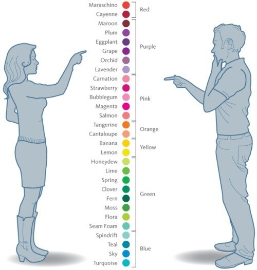
I re-arranged my list from my earlier post so I was able to place the neutrals more tightly connected to the colors. I also placed the new in colors where they really fit. I also added the oldest retired colors, luscious lime (a really bright almost fluorescent color) and rocket red, which is almost indistinguishable from poppy parade. There's also a few tweaks that are the result of adding the new colors.
This listing begins with the greens that lean toward the blues and goes around the color wheel to the greens that lean toward the yellows, which is a logical place to flow into the neutrals via those pesky true thyme and river rock that I can't decide on making them greens or neutrals. Now I don't have to decide!
Mint Melody
Handsome Hunter...Sage Shadow
Forest Foliage
Glorious Green
Bermuda Bay...Coastal Cabana...Pool Party
Taken with Teal
Island Indigo...Cool Caribbean
Pacific Point...Tempting Turquoise
Midnight Muse...Not Quite Navy...Blue Bayou...Baja Breeze...Soft Sky
Marina Mist
Buckaroo Blue...Bordering Blue
Bliss Blue...Bashful Blue
Ballet Blue
Brilliant Blue
Brocade Blue
Night of Navy
Concord Crush...Wisteria Wonder...Almost Amethyst
Vintage Violet
Lovely Lilac
Elegant Eggplant...Lavender Lace
Perfect Plum
Eggplant Envy...Orchid Opulence...Pale Plum
Marvelous Magenta...Mauve Mist
Rich Razzleberry
Baroque Burgundy...Purely Pomegranate...Pink Passion
Melon Mambo...Pixie Pink...Pink Pirouette
Raspberry Ripple...Rose Red...Regal Rose...Pretty in Pink
Bravo Burgundy...Cranberry Crisp...Primrose Petals...Strawberry Slush...Positively Pink
Rose Romance...Blushing Bride
Cherry Cobbler...Real Red
Poppy Parade/Rocket Red...Cameo Coral...Blush Blossom
Riding Hood Red...Ruby Red...Calypso Coral...Crisp Cantaloupe
Cajun Craze...Dusty Durango
Really Rust
Tangerine Tango...Groovy Guava
Only Orange
Pumpkin Pie...Peach Parfait
Marigold Morning...Apricot Appeal
Summer Sun
More Mustard...So Saffron...Barely Banana
YoYo Yellow
Crushed Curry...Daffodil Delight
Summer Starfruit
Luscious Lime
Kiwi Kiss
Lucky Limeade
Old Olive...Pear Pizzaz...Certainly Celery
Gumball Green
Green Galore...Gable Green
Garden Green...Wild Wasabi...Pistachio Pudding
Always Artichoke...Mellow Moss
True Thyme...River Rock (yellow-greenish)
Soft Suede...Baked Brown Sugar (goldish)
Creamy Caramel (orangish)
Chocolate Chip...Close to Cocoa (reddish)
Early Espresso
Crumb Cake
Sahara Sand (taupe)
Going Gray (warm gray)
Basic Black...Basic Gray...Smoky Slate (cool gray)
__________________
Diane
Oh wow thank you for putting this up for me. I have some of those older In Colors too so this will be very useful.
I love using colour but I my eyes glaze over when someone starts talking in terms of blue reds and yellow greens. I just can't 'see' it like others can.
I'll rearrange what I have in my ink pad holder and see if how it looks. Thanks!!
Looks good. I initially thought the starting point was a bit odd, but it makes sense when I see how it flows into the neutrals. Seriously I could never have put it in order like that. I'll live with this new arrangement for a while and see if it works for me. Then I'll know if I need to make a committment and change the card stock order too.
Seeing the names of some of the older colours made me nostagic for some of my past favs.
Thanks Fionna for putting all those colours in order. Last night I decided to just go ahead with reordering of my cardstock. Now all my older colours have a place instead of just bunched together in the back of the filing cabinet.
I think this reordering of my SU! colours will also liberate how I use my CS since it was very closely tied to me using the inks. I think for the first time in a couple of years I'd be interested in looking at the new colours for CS and not be concerned that I don't have a matching ink that I won't be buying.
I now have 10 slots in my colour caddy that are empty ( I removed the black and white inks as I don"t use them) so I'll keep my eye out for any older felt pads that might be on offer for sale to make my own complete custom set.
Once again thanks for doing what would have been a nightmare for me.
I'm so glad I took art in high school and learned (and painted) the color wheel. I started using SU in early 2009 so I have less than a third of what's on that list.
i JUST watched a show on hgtv and the people were looking to find a house near ewa beach. ewa = crooked it looks beautiful there. mele kelikimaka (spelling?) and good luck organizing!
i JUST watched a show on hgtv and the people were looking to find a house near ewa beach. ewa = crooked it looks beautiful there. mele kelikimaka (spelling?) and good luck organizing!
It's always funny to see a House Hunters episode when it's Hawaii. I watch the House Hunter shows, and see how much house money can buy on the mainland, and tell DH we need to move so I can have a huge craftroom. THEN I watch the news and see all the picture of snow, and freezing temps, and think, "Ummm, nevermind!" LOL
And, thank you, I'm going to need all the luck I can get when I start to organize my paper. I tend to get sidetracked, and end up with things in a bigger mess than they were to begin with. Right now I've got a long tote with all the original 48 colors plus neutrals in hanging folders with labeled tabs. That was great until the color change happened. Tjem I started accumulating all the beautiful In-Colors. Of course I had to stock up on retiring colors... I now have the hanging folders, and two large stacks of unopened CS of assorted colors. I don't even know which ones are retired, retired and brought back, etc. Yep, I have a big project ahead of me. :rolleyes:
Last edited by grateful2bsaved; 12-22-2013 at 10:06 PM..
i spent the entire day arranging all the colors. you can do it! i only have a handful of sheets i can't identify, and i just put them in a misc. folder for when i need to find just the right color. you will be soooooo grateful when it's done!
i spent the entire day arranging all the colors. you can do it! i only have a handful of sheets i can't identify, and i just put them in a misc. folder for when i need to find just the right color. you will be soooooo grateful when it's done!
I really am going to do it. I actually kind of like sorting and arranging stuff when I have a PLAN. I think that color arrangement is a perfect plan. Keeping them in the SU color families just wasn't working. Now my only problem will be finding the time to do it. Gee, maybe if didn't spend so much time reading all the threads ... LMBO Nah.
I've kept them in the familys, but the old, old way. I have retired sets of ink spots and have left my card stock in familiys sorted to what is in each set of spots. Other wise I didn't think I could ever find the ink that matched the paper.
I used Fiona's list a few weeks ago to put my cardstocks in ROYGBIV order. I used magazine racks to hold the cardstock. I tabbed each color. Behind the tab is a page protector, all the scraps of that color go into the page protector. When I need a color I check the scraps first to see if I have a piece big enough to use before cutting into a whole sheet. This system has been working well for me.
Dianne, that's a great idea. Duh. I even used page protectors to catch scraps a few years ago, but didn't think to put one with each color.
Now I have to Gibbs' Smack myself!!!!
Owww!
I used to have a gallon bag I put all my scraps in, but I never used them because it was too hard to dig out say, a Crumb Cake piece, from all the rest. I actually use my scraps now.
I used Fiona's list a few weeks ago to put my cardstocks in ROYGBIV order. I used magazine racks to hold the cardstock. I tabbed each color. Behind the tab is a page protector, all the scraps of that color go into the page protector. When I need a color I check the scraps first to see if I have a piece big enough to use before cutting into a whole sheet. This system has been working well for me.
One thing I've done which helps me a lot: I have all my 81/2 X 11 paper in a file cabinet. It's in rainbow or ROYGBIV order right now. all the paper is in the green hanging folders. The little tabs on the top where you put the plastic labels, I use the 1st slot for Brights, 2nd slot for Nuetrals, 3rd slot for regals, and 4th slot for subtles and the 5th and final slot for retired CS. That way, I can find paper by color, but know by tab position which family it belongs to. Make sense??
I like the above order better, starting with the neutrals, I may have to switch out the order and see how I like it.
The list that SARAHWMS posted... Does anyone know where Basic Brown fits in this scheme by chance? It's the only ink pad I have that doesn't seem to be listed. Thank you very much!
Karen...
The reason my listing (that Sarah posted) doesn't include the Basic Brown is that I did that list for the papers, not the inks.
But you are right...Basic Brown would be the only ink that wouldn't be on that list. It's somewhat in the reddish scheme, so I would suggest that you put it after the chocolate chip/Close to cocoa line and before early espresso.
OH, thank you so very much. I love the order in your list. My ink pads are now nicely organized and just so beautiful!!!!!!!
I wish I could get a similarly organized Colorbox Chalk and CTMH list... :0)
Thank you again, Diane.
K
I don't know how I missed this thread! I've been mulling over doing an overhaul on my cardstock drawer (filing cabinet), but wasn't sure which direction I wanted to go. Diane, as always, has a great solution! I tend to put things in alphabetical order because I can remember color names, but not which "family" they belong to. I switched to roughly ROYGBIV (all the reds together, all the blues together, etc.) recently, but this is probably the tweak I need to make me really happy - thanks, Diane!
I'm not sure I understand the need to change the way youstore the cardstock. Maybe I'm just not an artist but I just store mine in the families according to the su charts. Brights, subtles, neutrals, regals and in colors. What is non artistic side missing for the reason for a change? Oh, and I put all the retired stuff in scrapbook containers.
Muscrat, for me it is because I have a lot of retired colors and I want all my papers organized in one place. Also I don't want to have to keep remembering new families whenever there is a change.
Well that makes sense. I didn't think of that. I just threw my retired stuff in scrapbook cases and use it as go. I have five metal magazine holders for my current stuff. One color family per holder and then one that holds in colors. I have not ordered much in colors because they go out.
Another question, Diane...
I want to make individual pages for all of my:
pink inks,
reds,
oranges,
yellows,
greens,
teals and blues,
purples,
whites and glittery,
blacks and grays,
creams and browns.
I know this is a color wheel and the colors blend, but is this something easy to do? I want to be able to add to a system and I don't get rid of retired ink. I am planning on giving each ink color its own small piece of paper as a sample, so that I can take them out and make color combos.
If it's too much bother or you don't feel like it, that's totally fine. :0)
My thanks.
Karen
Karen - you could use a system like Jennifer McGuire does. She uses pages designed for coin collectors and puts 2" squares of ink or cardstock samples in them. If you add or subtract colors, you would have to rearrange a few squares, but not completely overhaul the system, you know? She has free downloads on her blog for different inks, too...
Hi Sue,
I've been doing something like that for the past couple of years, but I realize my samples are too small. And, as I've bought used stamp pads, I need to redo my system. I love her books, and took her inspiration for the coin pockets, but I personally like the inked image to be touching the edge to allow for better color matching, then to stamp in the middle of the swatch. Although, hers will probably looks better! Mine are one inch circles currently. CTMH was my "set" of inks, but after buying so many used SU pads from various sales, I realize I now have more of those. They are really my daughters inkpads, lol, but they have decided to allow me to use them, after we get them organized! I hate to have to redo my current pads, ugh, but I think it'll be so much better in the long run.
I really like Jennifer McGuire's charts, but I need to add more SU colors, and the entire CTMH line, and I can't get her editable chart to work for me. I'm not very savvy with computers!!!